Ux Case Study

BOA Spending & Budgeting Redesign — a UX case study exploring how to make Bank of America’s spending and budgeting experience simpler, clearer, and more flexible, from research through a redesigned flow and design system.
Background
I found many BOA users experiencing similar app issues.

Making BOA spending & budgeting simpler to manage
WHAT
Redesigning Bank of America’s Spending & Budgeting experience.
FOCUS
Improving spending insights, transaction categories, and budget management.
GOAL
Make the experience simpler, clearer, and more flexible.
Online Survey
I shared a short online survey on Reddit to gather feedback from BOA app users and identify common issues with spending and budgeting.
n = 32 BOA users
I interviewed two BOA users and identified several common pain points
Spending features were hard to find, categories were sometimes inaccurate, editing took too many steps, spending totals were unclear, and budget adjustments felt complicated.

Finding 1
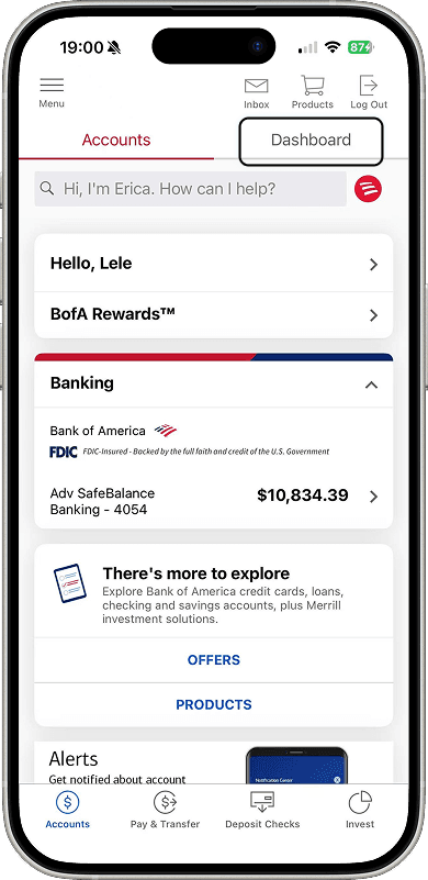
Spending insights are hard to find
Dashboard / Home → Spending tile → Spending & Budgeting → Spending breakdown / chart



Finding 2
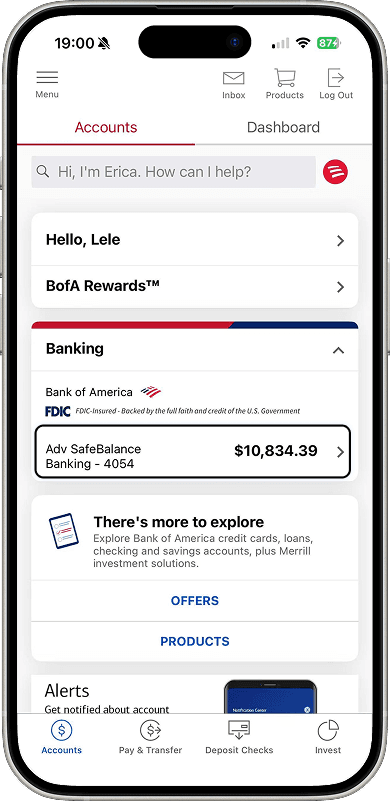
Category management is slow and repetitive
Dashboard → Spending → Transactions → Transaction → Category


Finding 3
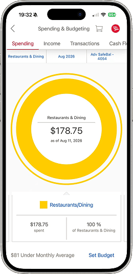
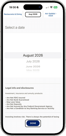
Filters and selections don’t persist
Spending → Dining → Transaction → Back



Finding 4
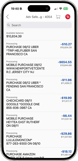
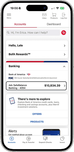
Spending totals are difficult to verify
Dashboard → Spending → Spending Summary / Monthly Spending & Account → Transactions / Activity


Finding 5
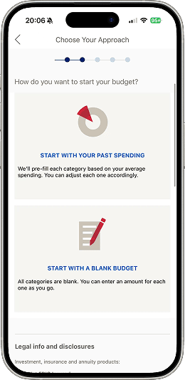
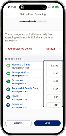
Monthly budgets are difficult to adjust flexibly
Spending Overview → Budget → Edit Budget → Confirm Income → Choose Budget Starting Point → Set Up Fixed Spending → Set Up Flexible Spending → Save Changes



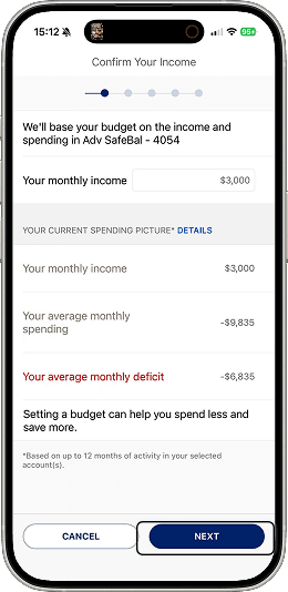


I researched other competing products on the market and compared their strengths to identify useful features and design opportunities.
Chase
Flexible time range selection — Users can easily switch between monthly, quarterly, yearly, and custom spending views.
Simple and flexible budget management — Budgets can be quickly adjusted by category, with real-time visibility into how much has already been spent.

Monarch Money
Flexible budget reallocation — Users can move budget amounts between categories without changing the total monthly budget.
Clear Cash Flow Visualization — Provides an intuitive view of income, expenses, and spending patterns through clear charts and categories.
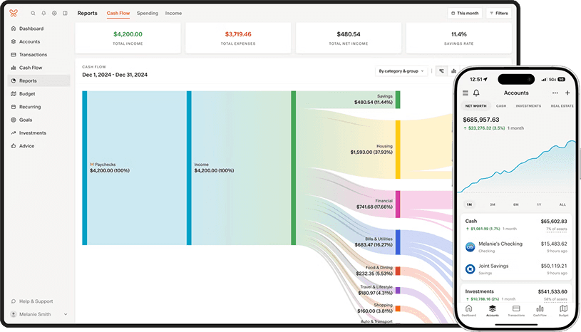

Copilot Money
Smart Transaction Categorization — Copilot learns from users’ corrections to improve how future transactions are categorized.
Fast Transaction Review & Editing — Users can quickly review transactions and correct categories without navigating through multiple screens.

ACCESS
Make spending insights easier to access and verify
Surface key spending information earlier and connect spending totals directly to the transactions behind them.
CONTROL
Give users more control over categories
Make incorrect categories easier to identify and correct, while allowing the system to learn from users’ changes over time.
CONTINUITY
Preserve users’ context throughout the spending flow
Keep selected filters, categories, and time ranges when users move between spending views and transaction details.
FLEXIBILITY
Make budgeting easier to adapt to real-life changes
Allow users to quickly adjust or reallocate category budgets as monthly spending needs change.
Current Track Spending Flow

Current Budget Flow

Redesigned Track Spending Flow

Redesigned Budget Flow

Core palette

Category ramp

Typography

WEIGHTS

NUMERALS

App low-fidelity
Entry

Track Spending
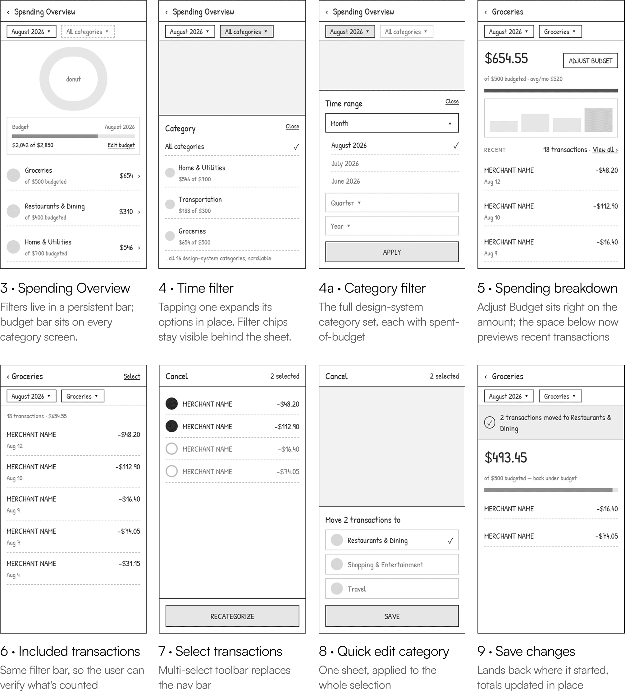
Budget

Web low-fidelity


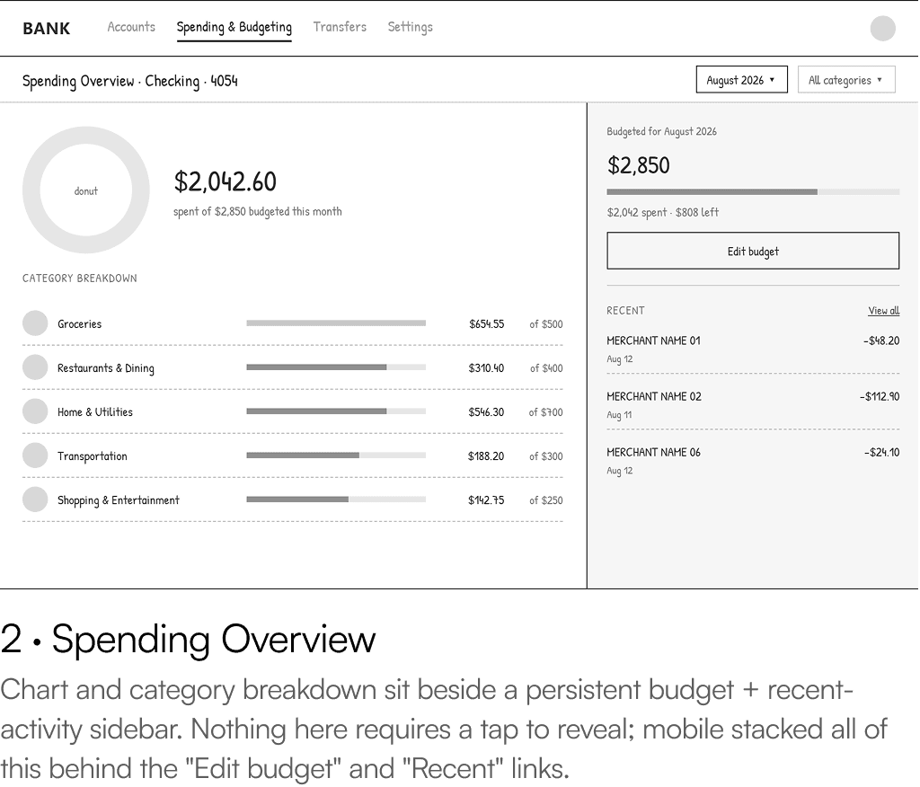
Mobile
Entry

Track Spending

Budget

Web


